
In evaluating print quality, these are the factors I take a hard look at:
• Colour Printing and Paper Profiles
• Tone Transitions
• Colour Shifts Under Different Lighting
• Surface Sheen on Luster and Glossy paper
• Black and White Qualities
• Paper Handling and Printing Speed
Colour Printing and Paper Profiles
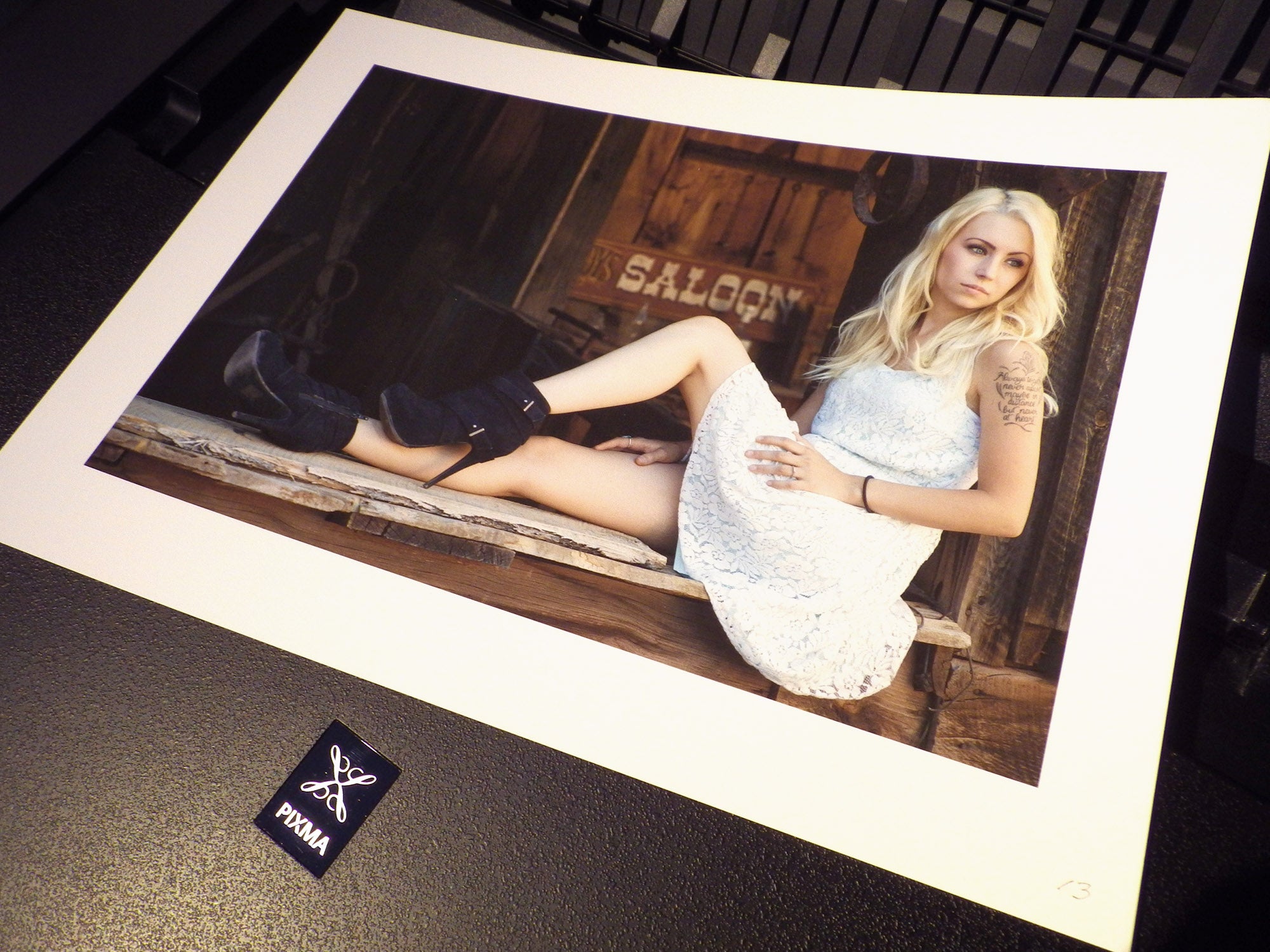
Most any quality pigment printer can print good colour these days and producing good colour isn’t a problem for the Canon Pro-1. It is a very strong printer in the sense that it can put a lot of colour on the page and hit the colours correctly.
A printer needs paper profiles to output the right colours. Usually these are available from the paper manufacturer’s web sites. Canon provides a directory of papers with available profiles on its website here: http://www.usa.canon.com/cusa/consumer/standard_display/3rd_party_papers
What if you can’t find a profile for your paper? Then there are two alternatives; use a paper profiling service or purchase a paper profiling tool. I recommend using the Color Munki Photo profiler. It produces high-quality profiles and will pay for itself after you have profiled 8 or 10 different papers. It will profile your monitor as well. In most instances the profiles you make with the Color Munki will be as good or better than the ones you find on-line. Owning a profiling device is a good way to get the very best out of the printer and it relieves any concern about being able to find the profile you need.
You will also need to tell the printer the media type, and for most common art papers they are listed here: http://www.usa.canon.com/CUSA/assets/app/html/EN/html/iccg01.htm
If you don’t see your particular paper listed, just use the Media Type for the most similar paper you see listed in the print driver’s options. The results will be fine.
Tone Transitions
Can the Pro-1 can handle smooth, subtle colour and tone transitions, especially in the highlights and the shadows? I threw it one image that has challenging tone transitions in both shadows and highlights and it handled it beautifully. Also I’ve been especially pleased with the printer’s ability to render flesh tones.
Colour Shifts Under Different Lightening
This issue, also called metamerism, used to be a big deal. With older generation printers, prints that looked fine under one kind of lighting would shift colour and look positively sick under another. Of course a print will look best under the lighting you used in evaluating proofs, however the print should look convincing, even if not optimal, under other common lighting types as well.
I evaluate prints under quartz halogens lights (or the LED equivalent) of about the same intensity used in art galleries. I checked the Canon prints under daylight and cool white fluorescent lighting as well. No problems here – the prints looked fine. However I’ll have more to say about this when we talk about black and white printing.
Surface Sheen on Luster and Glossy Paper
On glossy and luster papers the Canon has the best gloss enhancer that I’ve seen. The gloss enhancer is the clear coating that gives the surface of a glossy print an even sheen and Canon’s version for the Pro-1 simply eliminates gloss defects as an issue. My big HP also uses a gloss enhancer and comes a very close second to the Canon in gloss quality. Epson printers use a different strategy and incorporate a gloss modifier into the inks themselves. This works reasonably well, however neither ink nor coating is applied to the true paper white areas of an image so they may have a different sheen compared to the non-white areas. I prefer to have a separate gloss enhancer that can be applied over the whole image area.
Canon calls their gloss enhancer the Chroma Optimizer and this name seems reasonable because it delivers other benefits in addition to gloss. They describe it as “. . . a critical element to attaining professional print quality with accurate colour and reduced metamerism, on coated (glossy, luster and semi-gloss) papers. The Chroma Optimizer reduces the difference in ink droplet height to form a flat and smooth ink layer. The result is evenly reflected light, deep blacks, and bright, saturated colors.” My observation is that Canon’s Chroma Optimizer does what they say it does and that it represents an observable advance in printing on coated papers.
Black and White Qualities
As far as I’m aware, the Pro-1 is the only printer equipped to use four black and gray inks simultaneously to make true quadtone prints. For years making four ink quadtones was the holy grail of advanced black and white digital print makers who sought all the subtle, even, tonal transitions that make black and white images truly wonderful. Various custom printer modifications were attempted to achieve this. Now it is possible just by checking the “Black and White Photo Print” box in the Pro-1’s driver to switch it into black and white mode, where one black ink and three gray inks are used to make genuine quadtone prints. This mode also allows the addition of subtle amounts of colour pigments to tone the print as desired.
Given this new development, I focused a lot of attention on testing the black and white qualities of the Pro-1 on two different media types; coated papers (glossy, lustre, semi-gloss) and matte, fine art rag papers.
First I wanted to find out if using the special black and white mode on the Canon Pro-1 is superior to just sending a black and white image to the printer in colour mode. I sent it test gray scales in both Colour Mode and B&W Mode. Here is how I would rate the differences:

Sending a printer a grayscale and gradient chart is a severe test. It shows up things that will not be easily seen, if seen at all, in printing images. The Canon Pixma Pro-1 stood up to this test and performed impressively. The superbly smooth tonality and excellent tonal separation in the near blacks demonstrates that it really delivers on its promise as a quadtone black and white printer.
To get the best out of the Pro-1 as a quadtone printer, I recommend acquiring some sample packs of paper and printing test images until you find optimum choices for your work. For example, my tests showed the Hahnemuhle Photo Rag Ultra Smooth gave me the best blacks among the papers I tested. It also gave me the smoothest tonality and excellent tone separation in the near blacks.
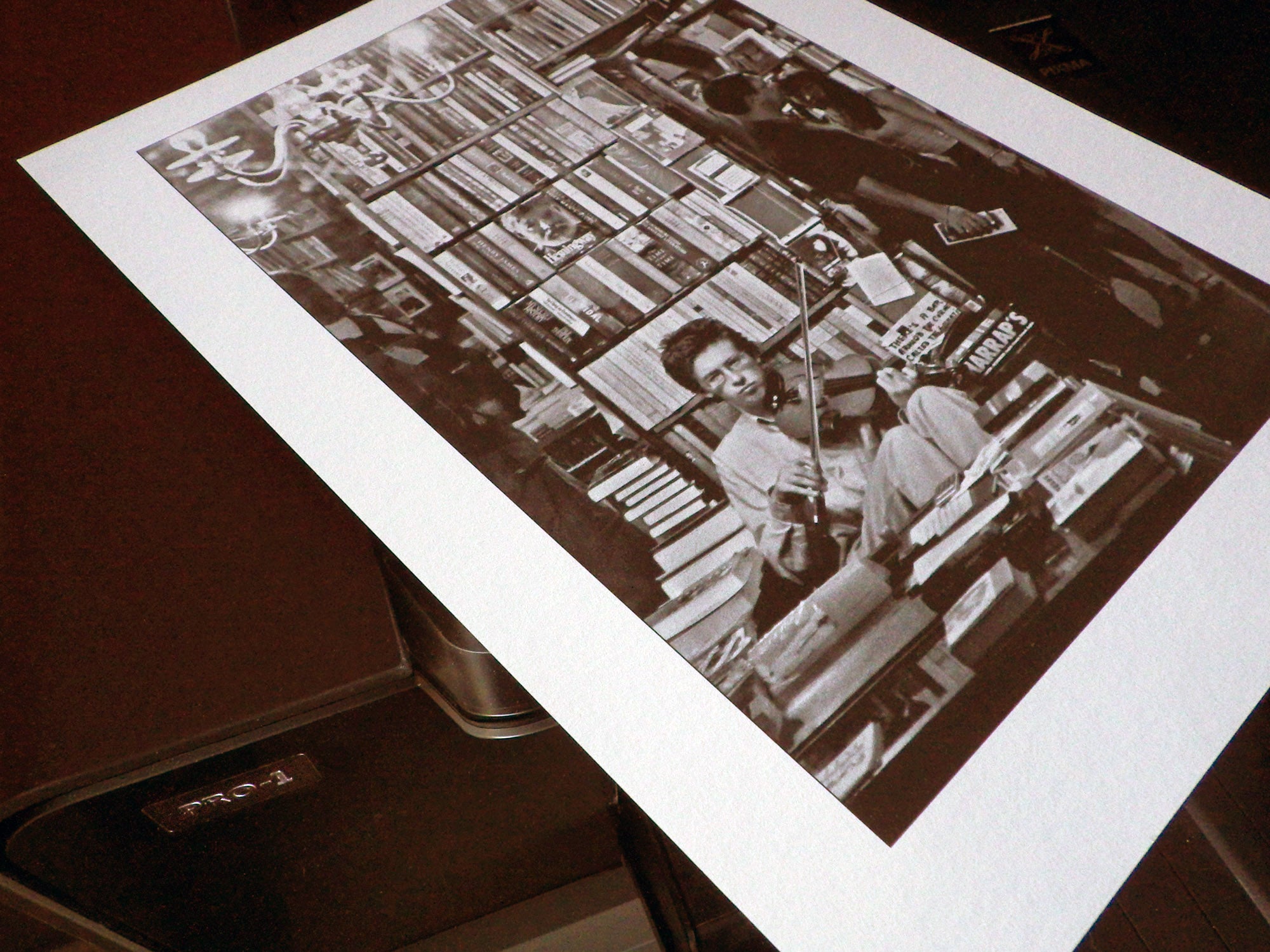
How significant is the ink bleeding? I didn’t notice it until I printed the grayscale, so I don’t consider it very significant. However if you are printing images with very fine, light detail among dense blacks, then select a coated paper. I’d try Hahnemuhle Photo Rag Pearl, a coated rag paper with a very soft lustre, which is about as close to a rag matte paper as you can find in coated material. It is also possible that there are other matte papers, which I did not test, that are less susceptible to bleeding.
This image illustrates the ink bleeding on matte papers. The HP z3200 exhibits this less than the Canon:

Paper Handling and Printing Speed
On fine art matte papers the Canon Pro-1 printer driver provides a restricted set of paper sizes and insists on wide borders at the top and bottom of the sheet.

You are limited to letter, A4, A3 or A3+ paper with a border that is 30 or 35mm wide at the ends. If you like these sizes and borders, then this restriction won’t be a problem. NOTE: This restriction only applies to matte fine art papers and does NOT apply to coated papers (glossy, lustre and semi-gloss) or to non-fine art matte papers.
I’m not happy about this restriction because I use rag matte paper in 9.5×13 inch sheets – an A3+ sheet cut in half. This is a wonderful size, comfortably larger in the hand than letter size but not as unwieldy as A3. There is no direct way for me to define this as a custom size for matte, fine art paper. I have to resort to work arounds. I’m not a fan of work arounds! My testing convinces me that Canon’s fine art paper border restriction of 30mm is excessive when using the rear top tray and that 12mm would be more than adequate. (I did not test using the rear bottom tray.) I hope they eliminate or further reduce these restrictions in a future update, as well provide a way to define custom sizes for fine art papers.
There is one work around that relieves both the borders issue and reduces the ink bleeding when using matte paper. The trick here is to select “Matte Photo Paper” instead one of the Fine Art Papers when you set the Media Type. The disadvantage with this selection is that the Canon Pro-1 puts less back ink on the paper and that limits maximum black density to 1.46 on Moab Entrada Bright 190. Subtle tonal differences in the very near blacks are also obscured. This work around is a good choice for images that have relatively small areas of maximum black.
By insisting on the wide borders, Canon is obviously worried about head strikes and/or paper advance issues near the ends thick fine art papers. These papers may be more warped toward the edges than other varieties. That said, recent papers I’ve used from Canson, Moab, Hahnemuhle and Epson have all been very flat and I’ve had no problems. However any printer can have issues if paper is insufficiently flat and flatness is something that should be watched for in selecting papers.
How fast is the Canon Pro-1? Actually that’s not a very good question because there is usually a trade-off between image quality and speed. The question should be, “Is the Pro-1 fast enough so I’m not waiting impatiently for prints to emerge?” The answer to the question is a definite, “Yes”. It takes in the range of 3 to 9 minutes for an A3+ 13×19 in. print to complete and in that time I seldom have the next image ready to send to the printer. So in answer to the first question – the Pro-1 is fast enough.
When I started my quest for a sheet-fed desktop printer I was looking for a machine that would at least equal the good qualities of my big, roll-fed HP z3200. The Canon Pro-1 matches or exceeds the performance of the z3200 in almost every area. In producing black and white prints with wonderfully smooth tonal transitions, the Pro-1 offers a significant performance boost over the HP z3200.
In summary the Canon Pixma Pro-1 is a printer that simply works. The images have truly lovely tonality and colour and are free of the artifacts and issues. As the world’s first commercially available quadtone black and white printer it delivers images with beautifully even tone transitions in B&W mode.
The Canon Pro-1 has changed the printing game in an important way. The learning curve to make good prints used to be pretty steep and a good part of the learning curve was to deal with maintenance issues or find the workarounds for the things that printers did not do well. The Pro-1 is as free from annoying issues and work-arounds as any printer I’ve experienced. It is a printer you can just turn on when needed and expect it will produce great images.
(Appreciation: I’d like to express appreciation to Royce Howland for his helpful discussion of printer qualities. Disclaimer: The views expressed in this article are mine alone. I co-teach digital printing workshops for The Camera Store. After I decided I wanted the Canon Pro-1, I asked and Canon agreed to sell one to me at a discount.)
